Exploring woozy, hauntological music and transmissions from a “half-remembered” parallel dimension, the esoteric Ghost Box imprint is defined by Julian House’s gloriously surreal artwork and visuals. With an ongoing campaign of back-catalogue reissues, the acclaimed graphic designer dives into his dazzling portfolio
Formed in 2004 by producer Jim Jupp and graphic designer Julian House, the truly eclectic Ghost Box label is a difficult one to pigeonhole. Operating in a bewildering realm of “TV soundtracks, folk song, vintage electronics, psychedelia, ghostly pop, supernatural stories and folklore”, and informed by library music, kosmische and musique concrète, Jupp has described Ghost Box releases as being made by “like-minded artists, creating music that sounds like it came from an imaginary past”.
The label’s roster includes Jupp’s own Belbury Poly (Belbury being the parallel domain setting for the label) and House’s The Focus Group projects, plus Pye Corner Audio, The Advisory Circle, John Foxx and Broadcast. Quite the sonic cocktail.
Rooted for the most part in a quintessentially English “otherness”, the Ghost Box oeuvre is steeped in a faded nostalgia that’s both uneasy and alluring, embracing the spirit of old public information films and those strange, wonky theme tunes from 1970s schools programmes.
That essential strangeness also feeds into the label’s stunning retro-futuristic artwork, designed and overseen by Julian House. Influenced by the work of Peter Saville, Lewis Carroll, Saul Bass and “the pulp end of things”, House has created cover art for Stereolab, The Chemical Brothers and The Prodigy, and has been art director on videos for the likes of Radiohead and Pet Shop Boys, among others.
Over the next few pages, House himself talks us through his beguilingly edgy mixed-media oeuvre…

“Even before we’d finalised any music, I was putting together mood boards and references that Jim and I would pore over. From my day job, creating album campaigns for bands, I had a sense that you’re never just doing a record cover – there’s a whole lot of other material that creates a world around the release. We knew we wanted to build that for Ghost Box, rather than just release a record.
“We started out creating music together, but it soon became apparent that our different approaches would suit two distinct ‘groups’. It made perfect sense that we would start the label with two releases, so when people came to it, they’d feel like they’d stumbled onto a label that had been there for a while.

“A few things helped to create the image and illusion of this Ghost Box world. A Penguin paperback-style grid – which hadn’t been copied to over-saturation at that point – made the records feel like part of a series. It also established a graphic look that nodded to our references and shared obsessions – a fusion of weird horror paperbacks and pedagogical early 1970s education, strange TV and half-remembered textbooks.
“The sleeves included footnotes and references – some real, some made-up – which sketched out the perimeters of our Ghost Box and Belbury world. The choice of back cover imagery and track titles fed into that too. There was a sense that something was being alluded to that wasn’t just the music.”

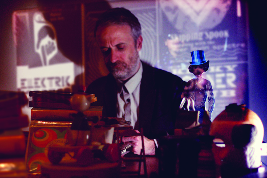
“In 2009, I DJed at the Le Weekend festival in Stirling, and I was also asked to put together a solo show at the Changing Room contemporary gallery. By this time, the aesthetic and look of Ghost Box was well-established and we’d built quite a lot of background story around the town of Belbury. A few obsessions came together in creating the concept of the show – modernist churches, strange late 1960s cults and the early 1970s boom in paranormal magazines.
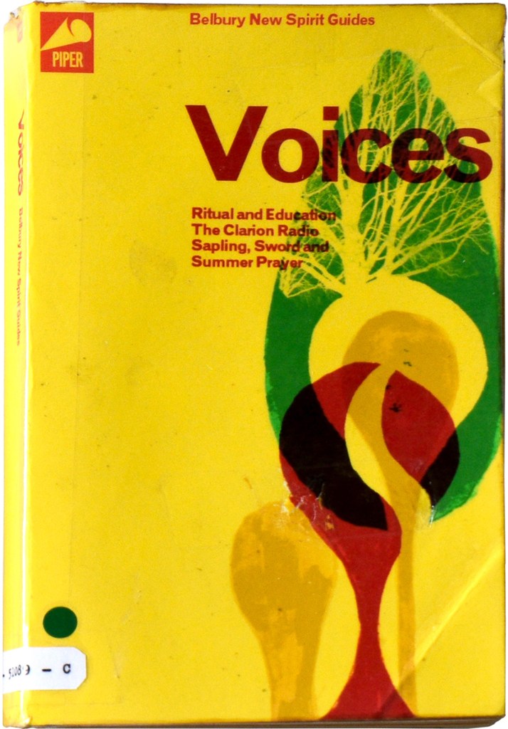
“The idea of ‘New Spirit Happening’ was of an event at the Belbury New Spirit church that wasn’t altogether Christian – a summoning or the opening of a portal, perhaps… something hinted. I think it was inspired by the cult rituals of ‘Quatermass’, the TV series in the late 70s. Around this idea, I created news clippings, photographs, flyers, posters, strange library books and other ephemera. Animated idents and title sequences were playing on old TVs, occasionally interrupted by fleeting glimpses of what could have been amateur footage of ghost or UFO sightings.
“It was, in effect, a multimedia show – a physical revelation of a lot of things we’d alluded to in our footnotes, track titles and graphics.”

“The A3 posters we produce are often a way of reinforcing the ideas that we put in. When we start a project, Jim and I will throw around ideas, concepts and reference images. I’ll take elements from disparate sources and starting points, and the visual language of the record will start to come together.
“For ‘Elektrik Karousel’, I was looking at International Times and the English underground press of the late 1960s. The record is a sort of weird kids’ TV version of toytown psych,in a way. We thought of having a pop art board game as a way of presenting the track listing and inside graphics. On the poster, we visualised the actual board together with playing counter characters to cut out.

“The inspirations for the ‘From Out Here’ cover included 1970s computer magazines, music education textbooks and images of strange, school-dance rituals.
“The A3 format lent itself to making it more like a Texas Instruments magazine advert, although the look is juxtaposed with Jim’s strange notes – part numbers station readout, part garbled paranormal recording.”

“The references we start with on a campaign often come from different sources and sometimes don’t seem to outwardly fit the Ghost Box world.
“For the ‘Puzzlewood’ album, I was looking at the 1960s and 70s posters of Tadanori Yokoo and Keiichi Tanaami, and the work of Milton Glaser and Push Pin Studios. Alongside this, we were considering some of Eduardo Paolozzi’s Moonstrips Empire News images – as an influence, they pull the more international pop references back into post-war Britain. We were also drawing on the bright, colourful packaging graphics in Jonny Trunk’s book ‘Wrappers Delight’. Nothing usually gets jettisoned… you can find a place for it somewhere else.

“I often work on several different approaches in parallel which complement and play off each other. In this case, the misregistered print and bubble gum-wrapper style of the back cover brings an element of a half-remembered 1970s childhood. This juxtaposition with the pop art influences somehow lends the cover image a more wistful air.”
The Focus Group’s ‘Hey Let Loose Your Love’ and The Advisory Circle’s ‘Mind How You Go’ will be reissued on Ghost Box


